 PRODUCTS
News // May 20, 2025

Written by Security Plus Shutters
The Psychology Behind Choosing the Right Colours for Your Window Furnishings
When it comes to styling your home, colour isnt just a visual detailit plays a significant role in how a space feels. Whether you’re selecting roller shutters, blinds, plantation shutters, or screens, the colours you choose can shape mood, perception, and even how you use a room. At Security Plus Shutters, Doors & Blinds, we believe that understanding the psychology of colour empowers our customers to create more intentional, personal spaces.
Why Colour Psychology Matters at Home
Colour has a powerful subconscious impact. Different hues can stimulate emotion, influence behaviour, and even affect how warm or cool a space feels. Thats why the colours in your window furnishingsoften the visual bridge between your interior and the outside worldshouldnt be a last-minute decision.
The right colour choice can:
- Make a small room feel more spacious.
- Evoke calmness, energy, or creativity depending on use.
- Complement or contrast natural light for optimal ambiance.
Choosing Colours Based on Room Function
Living Rooms: Welcoming Neutrals & Earthy Tones
Living rooms benefit from warm, grounding colours that make guests feel welcome. Soft beiges, warm greys, or muted greens bring in a relaxed, natural vibe. Pair these tones with timber elements or plants for added harmony. Light-filtering indoor blinds in these shades can soften natural light while maintaining privacy.
Bedrooms: Tranquil Blues & Soft Charcoals
Bedrooms are personal sanctuaries. Blues are known for promoting calm and restful sleep. Pairing pale or dusty blue blinds with white or light-toned walls creates a serene retreat. If you want a more modern, moody bedroom, try deep charcoal plantation shutters or blackout roller blinds for a cosy, cocooned effect.
Kitchens: Crisp Whites & Cheerful Accents
Kitchens often benefit from crisp, clean colours like whites, creams or soft greys to promote freshness and hygiene. Want a pop of personality? A splash of colour like soft yellow or pastel green in your window coverings can evoke energy and creativityperfect for the heart of the home.
Home Offices: Focus-Friendly Greys & Greens
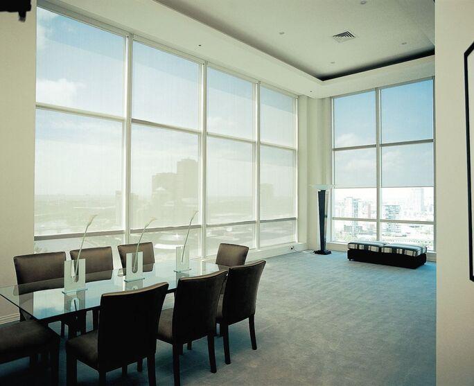
Productivity is key in a workspace. Cool-toned greys or subdued greens encourage concentration and reduce visual fatigue. Indoor blinds in these hues pair well with minimalist setups and help soften glare without making the space too dark.
Outdoor Areas: Nature-Inspired Hues
For alfresco areas or patio blinds, nature-inspired colourslike eucalyptus green, sand beige or slate greyblend seamlessly with gardens or exterior features. These tones help blur the boundary between indoors and out, making your outdoor spaces feel like true extensions of the home.
Light, Space & Direction: How They Influence Colour
The same colour can appear entirely different depending on the natural light a room receives:
- North-facing rooms tend to be cooler and may benefit from warm or creamy shades.
- East-facing rooms receive bright morning lightcool hues can balance this.
- West-facing rooms catch the afternoon sun, making warm tones glow but possibly overheat. Neutral colours can prevent this.
- South-facing rooms are naturally well-lit and versatile, allowing you to experiment with a broader palette.
The size of the space also matters. Light colours reflect more light, making small spaces feel open and airy. Darker tones absorb light and can make a room feel cosierbut can also shrink the space visually, so use them carefully.
Matching Colours With Your Existing Décor
Your window furnishings dont live in a vacuumthey should complement your walls, furniture, and flooring. Here are some styling tips:
- For modern minimal homes: Stick to monochromatic or neutral shades like whites, blacks, or greys for a sleek, understated look.
- For rustic or coastal vibes: Opt for natural tones such as sand, driftwood, sage, or off-white.
- For vibrant, eclectic interiors: Don’t be afraid to introduce bold contrastsnavy blue shutters with brass handles, for example, can make a striking statement.
The Emotional Impact of Popular Colours
Lets break down how popular colours are felt, emotionally:
- White: Clean, simple, peaceful. Works almost anywhere.
- Grey: Elegant, composed, neutral. Ideal for contemporary aesthetics.
- Blue: Calm, focused, cool. Great for bedrooms and studies.
- Green: Natural, rejuvenating, refreshing. Good for both indoor and outdoor settings.
- Beige: Warm, welcoming, classic. Ideal for traditional interiors.
- Charcoal/Black: Strong, bold, sophisticated. Perfect for contrast and privacy.
Balancing Style & Function
At Security Plus, our window furnishings dont just look goodthey perform. Whether its thermal insulation in summer, light control, or added security, the colour you choose should support your practical goals too.
For example:
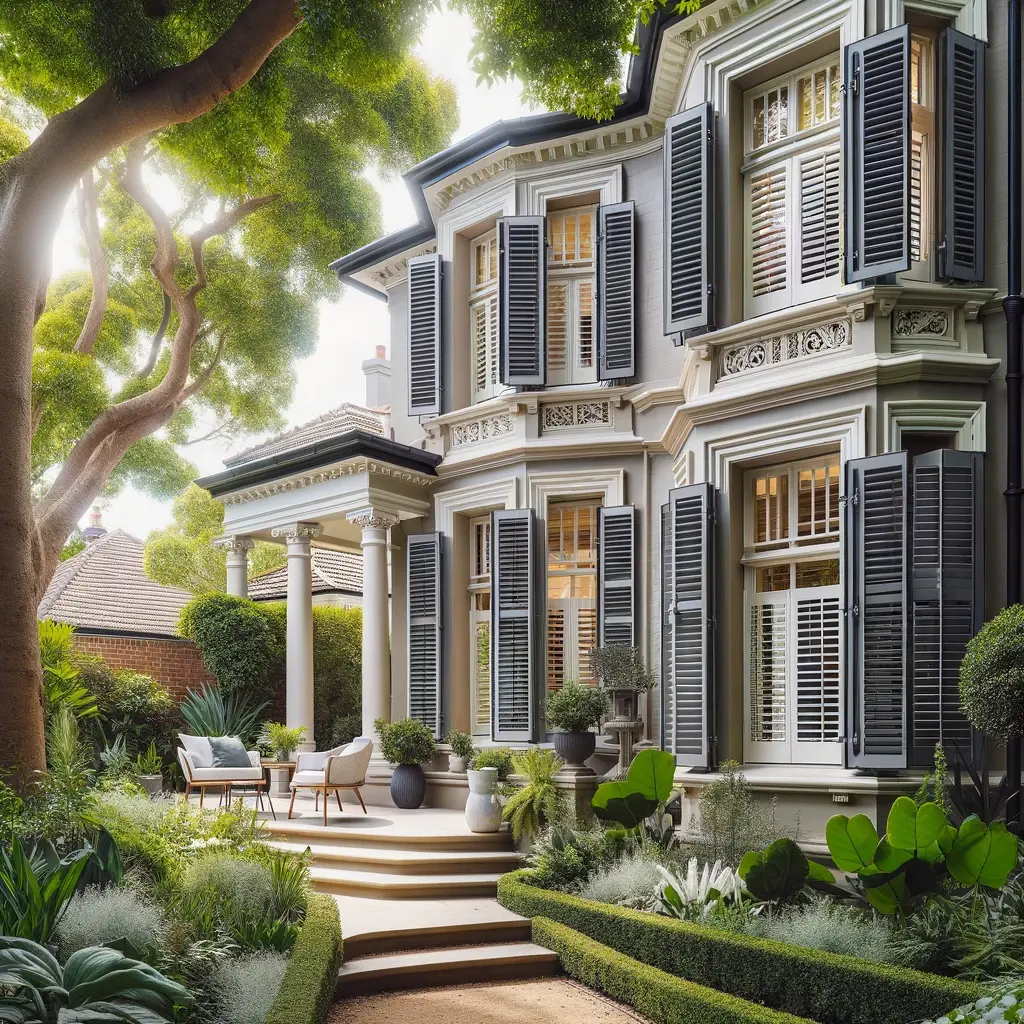
- Darker external shutters can reduce heat entry in warm climates.
- White or lighter indoor blinds reflect light and can brighten darker rooms.
- Outdoor blinds in mid-tone hues reduce glare without overheating the space.
How to Choose the Right Colour With Confidence
When you work with our expert team, you wont be left guessing. We offer:
- In-home consultations to see how colours look in your lighting.
- Custom colour matching to suit any palette.
- Sample swatches so you can feel the texture and test tone in context.
We understand that colour decisions can be personaland permanent. That’s why we offer tailored advice based on your lifestyle, décor, and functional needs.
Ready to Transform Your Space?
Whether youre styling your forever home or updating your investment property, the colour of your window furnishings matters. Its more than just aestheticsits about creating a feeling, an experience, a home that truly reflects you.
At Security Plus Shutters, Doors & Blinds, weve been helping Australian families bring their vision to life for over 30 years. Let us help you choose a colour scheme that does more than look goodit feels right.